Repainting Oklahoma City’s Skyline: Behind BancFirst Tower’s Makeover

In an effort to meet current tenants’ needs and attract new businesses to their buildings, office landlords have been extensively upgrading their assets over the past few years. In Oklahoma City, one overhaul stands out. Formerly known as Liberty Tower, the 36-story BancFirst Tower is the second-tallest building in the city, reaching a height of roughly 500 feet. Dating back to 1970s, the downtown office high-rise was in need of a makeover.
Building upon a relationship that goes back more than three decades, owner BancFirst tapped local architecture studio Bockus Payne for completing the multi-million dollar task. The renovation began in 2020 and took two years to complete, resulting not only in an up-to-date interior and brand new glazing, but also in a modern exterior public plaza.
Bockus Payne Managing Principal Mathew Siebert and Director of Design Collin Fleck expand on this extensive overhaul that increased the building’s occupancy to more than 90 percent.
What makes BancFirst Tower stand out in the city’s built environment?
Siebert: BancFirst Tower stands out not only for its sleek redesign but also for how it is contributing to the revitalization of downtown Oklahoma City. The $70 million renovation transformed the tower into a modern icon while honoring its storied past.
The meticulous attention to detail—from the programmable LED lighting that adorns the crown to the thoughtful integration of modern amenities—elevates BancFirst Tower to more than just a building. It’s a symbol of progress and possibility. We’ve already begun to see how BancFirst Tower is effectuating change as an inspiration for nearby buildings who’ve noticed the crown that illuminates the city skyline after dusk.
READ ALSO: Property Management Success: Attracting and Retaining Gen Z Office Workers
Tell us about the history of the high-rise and its condition prior to the renovation.
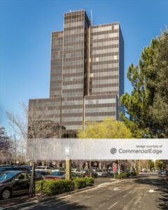
Siebert: Originally opened in 1972 as the Liberty Tower, the skyscraper changed ownership multiple times before falling into disrepair. BancFirst purchased the tower in 2018, recognizing both the strategic opportunity and civic duty to revitalize this iconic local landmark. At only 50 percent occupancy, the tower was at risk of becoming a burden for the city. BancFirst’s decision to undertake the massive renovation project was not just a strategic move but also a commitment to Oklahoma City’s revitalization.
Bockus Payne provided design expertise from the outset of the renovation project, outlining the upgrades needed to make the space viable and capable of returning to a thriving community asset. This included a menu of options based on value outlining potential pathways forward, from minor adjustments to a complete overhaul. After BancFirst decided to move forward with a full renovation … Bockus Payne oversaw architecture, interior design, and landscape architecture for the project.
Which parts of the building were renovated and how intricate were the changes you made?
Siebert: As part of Bockus Payne’s scope, the renovation encompassed the complete redesign of the exterior plaza, first floor, underground and tower façade. Also included was a re-roof of the high roof and modernization of the 14 elevators. Given the extensive nature of the renovations, the project spanned four years from concept to delivery. Concurrently, BancFirst renovated and occupied floors two to 15 as a separate project. All upgrades occurred while the building was occupied.
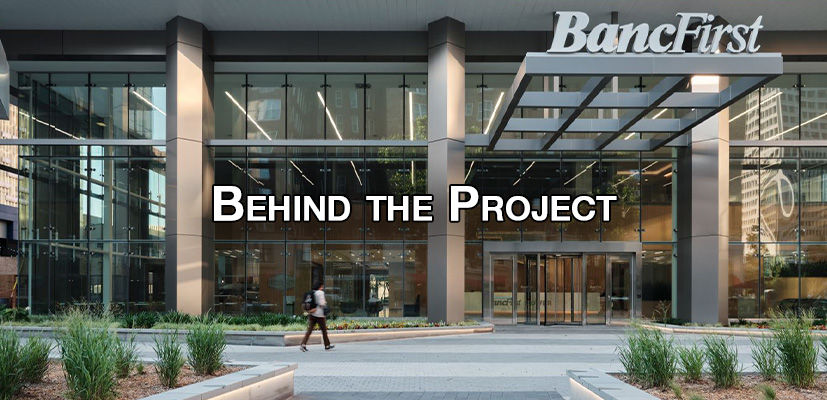
The renovation program involved a peeling-back of superfluous design details and enhancing transparency, through such strategies as removing the superficial columns that were unnecessary for structural support and led to a cave-like feeling in the interior foyer. We removed every other column and streamlined the aesthetic by removing the heavy concrete cornice detailing. These changes allowed the lobby to feel open and engaged with the street level and the urban fabric, letting daylight indoors and enabling pedestrians outdoors to see inside.
Bockus Payne replaced the bronze colored glass covering the tower with an energy-efficient, insulated blue glazing. Image by Justin Miers Photography
We replaced the bronze colored, single-pane, annealed glass that covered the entire tower with a stand-out, energy-efficient, insulated blue glazing that nods to the bank’s brand color. At the lobby level, in place of the old curtain wall system with its closely spaced, heavy vertical mullions, our team implemented a suspended, point supported structural glazing system with low-e, low-iron clear glass. This was instrumental in making the tower feel modern and lightweight …
BancFirst logos grace the north and south sides of the tower, reinforcing the brand’s prominence in the area. These iconic 14-foot elements symbolize BancFirst’s enduring dedication to community progress and prosperity, enhancing the tower’s status as a landmark in downtown Oklahoma City.
What amenities does the tower include now?
Fleck: Prior to renovation, the lobby and underground concourse were dark, cavernous and void of activity. In addition to bringing natural light to the interiors, we recognized the importance of activating these spaces so that they engage tenants and pedestrians.
The refreshed lobby design includes a BancFirst branch bank and relocation of the existing Petro Deli from the southwest to the northeast corner. The deli seating was enlarged to include both indoor and outdoor seating. The new lobby design also relocated The Buzz Coffee and Café, along with the Red Earth Art Center and Gallery to the south.
For the interior design, we drew inspiration from all things Oklahoma: waving wheat and bright wide-open skies, reminiscent of the Oklahoma prairies. Warm wood finishes such as white oak on the walls and modern marble accents create a clean-lined, timeless and inviting interior. In a cleverly curated design element that further nods to the project’s locale, angled wood patterning behind the central lobby desk visually represents stalks of wheat waving in the wind. Interior plantings further the biophilic effect, which extends seamlessly to the exterior plantings. Low-iron glass throughout the spaces allow for views across multiple spaces and allows daylight to filter inwards.
The underground concourse remodel includes a relocation of another BancFirst branch bank, a USPS mail center, relocation of The Executive Barber shop, along with a complete renovation of the Hot Tamale Grill restaurant. The Hot Tamale Grill is colorful and lively, welcoming guests to take a break from their busy day. Distinct design details include hand-painted ceramic tiles at the entry and a radiused slat wood ceiling above banquette seating. The white terrazzo counter is set against a deep blue Venetian plaster backdrop and just beyond is a wall-to-wall, floor-to-ceiling abstract mural that pulls all of the colors together.
A renovation of this magnitude must come with a lot of challenges. What was the hardest about working on this makeover?
Siebert: In addition to the building remaining operational during the entire renovation, one of the biggest challenges was the extensive facade replacement. This involved the removal of outdated bronze-colored glazing and the installation of new insulating, blue glass panels while constantly battling the Oklahoma winds. Additionally, reformatting the interiors and enhancing transparency while maintaining structural integrity posed significant challenges.
Tell us about the renovation of the outdoor plaza that connects the building to its surroundings on a pedestrian level.
Siebert: Our team transformed the outdoor plaza, formerly a sparse concrete vista, into an inviting space with ample seating and green space for use by employees and passers-by. To do so, we studied circulation paths to conceptualize an engaging layout while balancing security. Native grasses and Oklahoma Proven plants were specified to create movement and energy in the Oklahoma winds.
The existing plaza had large concrete tree wells that extended down to the underground concourse level, where they appeared as dark windowed spaces with neglected trees. We transformed three of the tree wells along the west elevation into artistic, point supported, structural glass ‘lanterns.’ These lanterns transformed the underground by bringing natural daylight into the space during the day and provide an external glow at night by employing color changing LED light fixtures cast onto fritted glass. What was once an inward void has become an outward projection that provides ‘light’ both day and night.
Public access from the plaza level into the underground concourse is provided via a stairwell within the northern illuminated glass lantern. We repositioned the primary underground circulation path to occur below the lanterns along the west wall, bringing in exterior views. We also prioritized bright and engaging employee spaces such as the BancFirst breakroom, situated beneath its own lantern.
After the pandemic, office renovations became more popular than ever. How do you see this trend evolving going forward?
Siebert: The trend of office renovations and repurposing is likely to continue as companies adapt to new ways of working post-pandemic. We are seeing a greater emphasis on creating flexible and collaborative spaces, and prioritizing employee well-being. Buildings like BancFirst Tower, which offer modern amenities, community gathering spaces and connectivity to their surroundings, will remain highly sought-after.
The post Repainting Oklahoma City’s Skyline: Behind BancFirst Tower’s Makeover appeared first on Commercial Property Executive.


