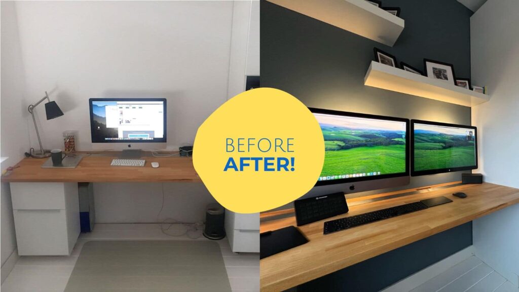
A dated Home Office gets a Modern Update

Seeing how IKEA hacked furniture has held up over time is always inspiring. Sander first shared his home office design eight years ago and recently undertook a modern redesign of the space. He sent me a note: “Can I add an update to my project? Got a lot of stuff changed.”
I said sure, send it over. So, he did, and voilà! Same room but so different. I felt like I was in a makeover show where I go in blindfolded, and the next moment, I’m cupping my face, exclaiming, “What? How did this happen?”
While the foundational elements of the home office, such as the IKEA kitchen cabinets and countertops, have remained unchanged, Sander has succeeded in designing a home office that’s significantly cozier and inviting. I can imagine myself hammering out hours of work in this small yet comfy home office.
Scroll all the way to the end for before and after comparison.
Throwback to the original home office design
Initially, his decision to create this home office space was driven by the need for additional rooms after the arrival of twins. Sander used IKEA METOD kitchen cabinets (similar to IKEA SEKTION kitchen cabinets), measuring 60cm (23.6″) wide and a 63cm (24.8″) deep countertop to create an office desk with storage drawers. On the right, an IKEA high cabinet made for the oven provided ample storage for files and supplies.
Kitchen countertop to an office desk
Sander sliced the countertop and slid in a stainless steel plate to create a deeper work desk, providing the extra space he desired. It also worked as a nice contrast to the wood desk and white cabinets.
Oven cabinet to printer cabinet
He ingeniously repurposed the area designated for an oven to accommodate his printer. A small strip of trim concealed the heavy-duty shelf behind it and blended the shelf with the regular IKEA kitchen cabinet.
Storage cabinets
On the opposite side of the office, Sander incorporated two existing cabinets, complemented by new doors. Additionally, he integrated a different IKEA cabinet and crafted a wooden countertop to match his desk. Sander placed the cabinets higher to skim the baseboards to ensure a good fit.
Designing a home office with IKEA cabinets: Updated 2024
Sander began a complete makeover to bring the office up-to-date, starting with a fresh coat of paint. The once stark white walls transformed, now a soothing warm shade of grey.
I was happy to see the office desk and cabinets still in excellent condition and looking no worse for wear. Besides upgrading his office gear, Sander installed floating LACK shelves above the desk.
The most impactful addition to Sander’s home office design is undoubtedly the slatted wood wall behind the sofa. This element effectively unifies the various sections of the office layout and infuses the space with a remarkable sense of warmth that was missing in the previous edition.
Moving on to the opposite end of the room, Sander reimagined the layout. He removed the tall cabinets, opting for a configuration that included both base and upper cabinets, with a deliberate gap between them to accommodate a TV and more countertop space.
Designing a Home Office, Sander’s style
Paint the walls: Wall color is one of the easiest ways to make a high-impact change. If your office has light-colored walls, then go dark. And don’t paint just one wall; go all around and even on the ceiling if you want to go for a bold change.
Add texture to walls: Sander’s wood slat wall added a layer of texture that instantly elevated the room. Other than wood slats, wall trim (wainscotting) is another way to dress up the walls.
Change the hardware: A subtle change in the color of the long pull handles made a difference. The black handles blend much better with the new office decor than silver.
Incorporate more light: In designing a home office, it is often easy to overlook lighting. What worked in Sander’s home office design was how he wove in a lot more indirect light. Lighting strips were added to the back of the monitors, gently bouncing light off the walls. He installed a puck light in the printer nook, placed table lamps on the counter, and changed the big ceiling light to softer spotlights to illuminate the slatted wall.
Personal touches: The final touches infuse the space with significance. Make room to display photos, trinkets, and collections that hold meaning.
Plants: Add plants. They make any space better.
Here are some side-by-side comparisons.
Did you design your home office with IKEA? Share it with us.
The post A dated Home Office gets a Modern Update appeared first on IKEA Hackers.


